Category: software

The Cost of Waiting for Feedback in Software Development

[In the series ‘Explain this to me like I’m a manager’]

Let’s imagine you are paid to write emails.

The company you work for has a policy that all public emails from an executive should be written by someone with a clear head and proper training. That someone is you.

It works like this:

  1. You receive an in-person briefing from the executive of what the email is about.
  2. You go back to your office to work on the email. In case a question arises, you phone the executive and usually get an answer right away.
  3. When finished, you present your email and edit it together until you’re both satisfied with the result.

The whole process takes about half an hour up to several hours.
This seems OK. It might even be kind of fun, right?

Now, imagine a different way of working

The only difference is that you’re not sure when you’ll get feedback or approval. It might be right away, or it might take several weeks.

Since you don’t know how long it’ll take, you start working on the next task. Instead of having 1 email “in progress,” you might have 20, 30 or a whole lot more.

This the exact same job, with the same input, but it seems much more cumbersome and a lot less fun, or not?

Well, unfortunately, this is the way most developers are working

In this example, we’re assuming there is no middleman (PM, analyst…) through whom all communication passes, introducing his or her own ideas, obfuscating the message in the process.

As a developer, I have often found it very frustrating when it takes ages to get feedback or answers.

You start working on something. You get stuck, you need feedback. Because you don’t know when you’ll get answers, you put the task on hold and start working on the next one.

But wait, the client has the exact same frustration!

Yes, I’ve been there: for several years, I worked on the other side, steering contractors/freelancers to develop custom software for our organization.

It is just as annoying to give extensive feedback to a developer, only to get additional questions 2 weeks later. These questions are usually ones that could have easily been answered if asked right away, but 2 weeks later, I can hardly remember what it was all about!

Surely, there are better ways to waste my time!

What is the engineer’s solution?

Let’s use a tool to manage all this “work in progress”, with statuses, flags, due dates, source integration, custom fields, assigned persons, reports, milestones and all that jazz.

This is an often unnecessary over-complication that is regarded as standard practice.

“That’s how it’s done!”

There are indeed situations that demand this way of working.

But, most of the software projects out there are actually quite straightforward and don’t benefit from these “solutions.”

The root cause is still there: it takes too long to receive feedback. As humans, we can’t temporarily store our built-up understanding—our “grasp”—somewhere until we need it again.

So, what’s the alternative?

We are all busy and we can’t just drop what we’re working on whenever someone demands our attention. But what if we could?

What if we could work on 2-3 tasks at the same time?
What if we didn’t need tools (except for a basic to-do list) to manage the progress of all our tasks?
What if we could work intensely with the client on a few tasks from beginning to end? And not start a new task until these were actually completely finished?

Why am I asking these questions? Because it would save time, money and frustration!

This is one of the core elements of several task/project management frameworks that suggest focusing on a limited number of tasks during so-called “sprints,” or that impose a limit on the “work in progress” (a WIP limit).

Often advocated. Seldom practiced.
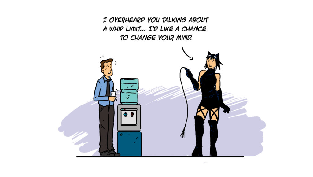
And really, no one is asking you to drop everything at every question; just don’t let things slide forever.

Do we really waste that much time waiting for feedback?

There was a study, conducted at Palm in California, the makers of the first PDAs. This study measured how much longer it takes a developer to fix a bug detected 3 weeks later instead of on the same day.

Now, how much longer do you think it takes?

About twenty-four times as much, no matter if the task is big or small.

Did you also fall off your chair? My initial guess was 5-10 times, which should be enough to inspire anyone to give this some additional thought.
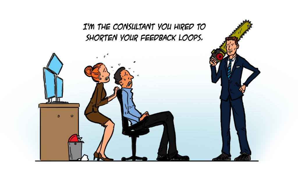
But waiting endlessly for feedback isn’t the only cause of WIP explosion!

It’s also:

  • The delay between analysis and development
  • The delay between development and testing (if you use testers)
  • The delay between a developer reading the tester’s feedback and acting upon it
  • Waiting for approval or a sign-off on something

Now, how do we fix this?

Well, it’s not that hard… to write about! 🙂

Here are my suggestions, which should work no matter what role you’re in:

  • Try to get everyone on board. Send them the link to this article. Or send them this excerpt from The Scrum Book; the author is just a bit more known than me, so it might work better! 😉
  • Lead by example: give feedback and answer questions on the same day or at least within 24 hours.
  • Explicitly state that you try to give feedback asap. Actively request the same from everyone you work with, including clients and managers. Follow up if necessary. A lot of people let things slide until they notice you’re consistently following up.

And, if your role allows:

  • Try to get everyone (necessary/needed) working on roughly the same task(s) at the same time.
  • Try to limit the number of tasks and the “work in progress.” Impose a WIP limit.
  • Cut the number of in-between-persons. They often serve no real purpose, except to consolidate or translate information. Developers often communicate too technically. I still make this mistake myself. But I also believe you can learn to communicate on a more non-tech human level. Listen to what is really being said, and try to respond at the same level using the same words.

I think it’s always better to have direct communication lines because it improves the possibility of learning from each other.

But I’m a developer. I can’t just demand my client’s attention!

You’re not demanding immediate attention; you’re asking not to wait for ages to get a reply.

I know this is not the standard way of working for a lot of developers: being proactive instead of reactive, reaching out instead of tackling that next user story or bug. I don’t mean to be condescending. I speak from my own practice, from the mistakes I’ve made, from experiences with failed as well as successful projects.

This might be one step (of many) to becoming a “10x engineer” and to show that you’re on top of things and care about the project.

Remember, all those non-tech people you’re working with really don’t know much about software development.

There’s nothing wrong with steering and educating them on how to optimize the process and save time and money. Who could be against that? (Unless, of course, your time is billed by the hour 😉

… And what if you get feedback from multiple sources, contradicting each other, even contradicting your own opinion?

Tackling “Design by Committee” is another story. Sign up here and stay informed.


Recognising a Bad User Interface at First Glance

This article trended on Y Combinator’s Hacker News where it generated an elaborate discussion.
It was also voted the Best “Everything Else” Article of July 2015 on CodeProject.
And translated to Japanese (with my approval).


When I wrote my previous blog post, it dawned on me that a trained eye can often spot unfriendly software a mile away.

It’s just like forming and making a first impression when you meet someone new. Apparently, this takes about one-tenth of a second.

Unlike judging a person though, judging a user interface isn’t part of our instinct… yet. But within just a couple of minutes, and often much faster, it’s possible to get a pretty good impression of whether the user interface was thought about or rather just an afterthought.

As I wasn’t sure of how this happened, or which warning signs were actually firing, I started to pay attention and take notes.

Here are my findings…

Too generic or inconsistent use of terms/labels

These aren’t the user’s words, but rather ones the programmer comes up with.

I trialled event organizing software the other day. The visitor/attendee was sometimes called ‘user’, which confused the hell out of me (you could also add additional users/logins that weren’t visitors).

At the company I work for, we once prototyped a new wizard-like process. It consisted of several screens that used 3 different words to depict the same person: the trucker, the cardholder, and the starter (needless to say this was corrected before going into production… and why does this reminds me of The good, the Bad and the Ugly?).

When you know how the process works, you won’t really notice this. But when you’re confronted with this software for the first time, you might wonder whether they’re talking about the same person, or different persons in separate roles, or… who knows?

You don’t want to confuse your users. Hallway testing helps here.

An Excel/development IDE – like user interface

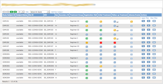
If you ask an inexperienced non-tech person to design a user interface, it often looks like it was designed in Excel. Excel is the most unconstrained application most people know, and a lot of software starts out as an Excel sheet before growing up into ‘real’ software.

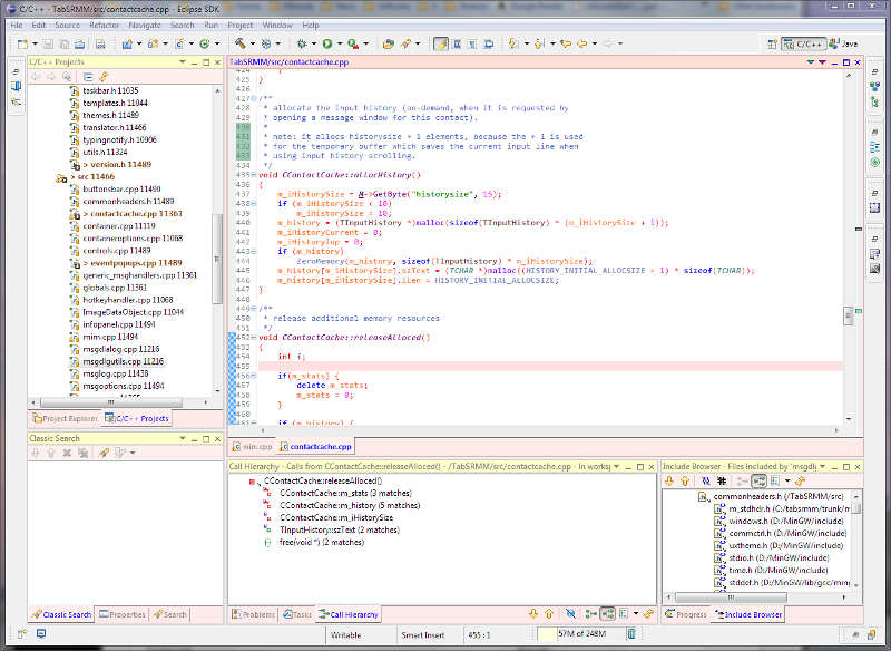
On the other hand, developers have a knack of seeing everything as the user interface they’re most familiar with: their development IDE.

eclipse-ide_sm

Use of image-only icons/buttons that have no distinctive meaning

Stock icon images seem suited when you already know what they represent, but when you see them for the first time you often don’t have a clue.

Unless it’s absolutely necessary, use words instead of icons… even though icons look better.

undefined icons UI

Unclear/confusing error messages

(written by the programmer).

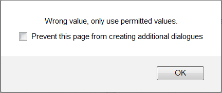
Pointless error dialog

Test this by entering an incorrect value in a field or leaving a required field empty.

Do you immediately know where the error is (even without having read the error text), or do you get a generic ‘fill in all required fields’ or ‘this is not a correct value’ error?

Even worse is some database error text. Or no error at all, resulting in a record that wasn’t saved without you knowing it.

Too much text/instructions

‘If you are an X, then you have to fill in Y and Z. If you are not an X, please only fill in Z, unless Z=1, then you should fill Y too.’

I don’t know how this is in other countries, but in Belgium it feels like you’re filing your income tax.

This is typical of programmers being ‘smart’ by avoiding some extra steps/code… and shouldn’t get past QA. Things like this will not only cost you customers, but will also cause a lot of unnecessary service-desk requests.

A long time ago (the previous century actually) I developed EDI software, based on ‘Message Implementation Guides’ (MIG) that contained constructions like these. And instead of thinking about making this more transparent, we just gave the user a number of fields and the MIG’s instructions on which fields should be filled in which case. That was the way it was done, and we didn’t give it a second thought at that time. Thank god for the ability to learn from mistakes.

Message Implementation Guide

Excerpt from an EDI Message Implementation Guide

I’ve even seen this taken one step further into absurdistan when someone thought it was clever to ‘implement’ 2 different messages (data structures) that had some similarities in 1 set of forms.

The time this saves the developer never weighs up to the users getting confused and calling support.

Weird, irrelevant and complex date/time formatting

For example: ‘2015-06-29 15:44:21 EST’, which is probably the default, unformatted output of whatever language/framework the software was programmed in.

15:44 might suffice, or Jun-29 15:44 (which makes sense to European AND US users).

In some cases it can be better to have a more human, relative notation, e.g. ‘within the last hour’, ‘yesterday’, ‘next week’…

Being too Mouse-dependent

No logical tab ordering, no keyboard shortcuts: the need to do everything with the mouse.

This has been annoying users since the invention of the mouse.

Too many pointless message boxes

‘Are you sure you want to print the document?’

Then showing the print dialog where you can still cancel the printing process.

And just how bad is it to print something by accident that it needs your permission in the first place?

Inconsistent warning dialogs

A while ago I saw a CRM-ish application.

When exiting an unsaved contact’s form, it said
‘Are you sure you wish to exit without saving?’

When exiting an unsaved company’s form, it said
‘Save changes before exiting?’

Clicking ‘yes’ obviously gives two different results here.

The user interface is totally empty when starting out

When seeing a ‘clean’ installation or account, there are no instructions to get you started.

You should guide your users towards taking their first steps here.

“You don’t have any contacts yet. Click ‘add contact’ to add your first contact.”
“We see that you’re new. If you want a short tutorial click here.”

You get the picture.

Visual clutter

Unneeded use of separating lines, grouping boxes,.. less of these = easier on the eye. It’s much better to group things together by position than by placing them in the same box.

Do you know more immediate clues that you’re dealing with a lousy user interface?
Tell us in the comments!

Being User Friendly Beyond the Software

A company I once worked with had such long emails that users used to phone to ask, “You just sent me an email… could you please explain what’s in it?”

It was also common that when someone called with a question that wasn’t in the email, the email template was changed to include the answer. That seems the right, logical thing to do, no?

Unless the emails become so long that no one bothers reading them anymore.

Also, when customers called, the support team explained things with the terms they were seeing from the internal software – “I’m sorry sir, your validation is still ‘unverified’.” Unfortunately, in most cases, it meant absolutely nothing to the customer, they didn’t know what their ‘validation’ was and why it was ‘unverified’. And you could see the support people get annoyed because they had to explain this same thing over and over to the ‘stupid users’.

Making your user interface more friendly is an iterative process. The support requests should be regularly checked for recurrent issues so they can be fixed/clarified.

Agree or not? Do you know more immediate signs of a bad user interface?
Tell us in the comments!

Sign up here for more enjoyable, insightful and (dis)informative posts!

Header photo by rdolishny, used under CC BY-NC 2.0

Enterprise Software Acquisition: What’s Missing and How to Fix It

Enterprise software isn’t user friendly. It’s often so bad that it costs you time and money, on top of an already hefty price tag.

Sure, ‘user friendly’ is one of the requirements, but no salesman will admit that their software isn’t. And you often can’t really put it through a ‘trial’ in advance, because it takes installation, configuration, training, customization, blah blah blah.

And why does it need so much configuration? Because not only do you have a huge list of requirements (lots of them irrelevant and unnecessary), but the other clients had their specific requirements too, and a consultant needs to ‘program’ the configuration to make it work according to yours.

The good thing is that they’ll throw in some unneeded features for free. This makes the software even more of a jungle to manoeuvre, but hey, no problem, surely they’ll arrange some training for you. And if that doesn’t work, just contact their outsourced support and talk to someone who doesn’t understand half of what you’re saying and vice versa.

Yes, this sounds a cynical, but it’s all true, Dilbert said so!

dt010414

Hallway testing to the rescue!

“A hallway usability test is where you grab the next person that passes by in the hallway and force them to try to use the code you just wrote. If you do this to five people, you will learn 95% of what there is to learn about usability problems in your code.”

Joel Spolsky, The Joel Test – 12 Steps to Better Code

It takes some guts to ask and explain, and people often (virtually always) find it weird. But in my experience, it’s the single best thing you can do to make your software better. (Actually, I’ve got some tips to take the edge off the experience, but that’s out of scope right now.)

So, that’s my proposition: Maybe the vendor can’t provide a ‘real’ trial installation, but surely they have an installation somewhere (what the developer is testing on if necessary) where you can have some of the future users perform basic tasks, and see how far they get without training/asking for help.

And if the vendor can’t facilitate these tests, it means they don’t even have a way to demo or test the software themselves. This is such a huge red flag that you should just forget about them. And if it’s not, they’re lying and errrm… you should just forget about them

Hallway testing has proven invaluable to me when trying to produce user-friendly software. It can also be applied to test third party software before committing.

By the way, “Don’t Make Me Think” by Steve Krug is a very entertaining, short and to-the-point book that you can read in one sitting and will benefit everyone somehow involved in developing (or acquiring) software. If you’ve read this far, it’s very likely that you will benefit from reading it.

Isn’t Hallway Testing only for occasional processes?

I know some might argue that hallway testing is only good for less used software/processes where no training is wanted.

Like a shopping cart checkout process, requesting a day off, or booking an appointment at the doctor’s office.

Some software might have a steep learning curve that pays off by saving you time later on. This software isn’t suited for hallway testing.

It’s still possible for a user interface to cater to new as well as experienced users. You should also be able to accomplish the core tasks in an intuitive way without having to jump through hoops.

Think about how much smoother user on-boarding would go if the software were easy to slide into from day one.

Some example Hallway Testing tasks

Let’s say you’re evaluating a CRM system — I think it would be safe to assume that a new user should be able to do the following:

  • add a contact
  • search for this contact
  • change the contact

And when evaluating a bookkeeping/invoicing system:

  • add a client
  • make an invoice for this new client
  • send the invoice through email

If you need training or a manual for such basic tasks, it’s safe to assume that there’s something wrong with the user interface. Don’t you agree?

Other things to keep in mind

Modern software should be able to talk to other software

Does it provide some kind of API (preferably a web service) to communicate with other software?

This is often overlooked.

If possible, get a programmer to take a look at the API: how difficult and complete is it? This doesn’t have to take long, you can get a good enough impression in about an hour tops.

A while ago I was exploring the possibility to have some of our software talk to one of our partner’s systems. This supposedly required custom development from the vendor, as there was no way to interface with this recently purchased software.
And this in 2015.

Another vendor I talked to had an API but no documentation :-/

Responsiveness is a requirement

Responsiveness is just as hard to define as ‘user friendly’, but just as important. It’s absolutely crazy that a human has to wait ‘while the computer is thinking.’ Still, how often does it happen?

Slow, unresponsive software costs not only time, but also a lot of frustration. We all know, but too often ignore this. We often also don’t seem to have a choice but to live with it.

What about including these requirements:

  • The user should never have to wait for more than 2 seconds, except when generating a report or performing a search.
  • Report generation/searches should be able to run in the background.
  • 95% of the user’s actions should give a response in less than 1 second.

Yes, these might be hard to measure, and they might be a bit strict… but it should open the conversation to what is feasible, and what is and isn’t acceptable for the users. Let that salesman sweat a bit!

I’ve seen a very responsive, snappy system grind to a halt when coping with a standard load. This could only be solved by throwing more and faster servers at the problem.

Later on, rather by accident, someone discovered the database had been totally misconfigured. If the ‘expert’ investigating the original issue had been a bit more competent, this would have saved a shitload of money. But alas.

Did you hunt on google for alternatives?

There are lots of SAAS providers for the craziest things. They often don’t come with a month-long sales process, a salesman that’ll have lunches with you, consultants to configure everything and trainers to get your users going.

They also lack the hefty price tag and often have a trial version you can try for free.

This software is often user friendly by default. It has to be — it needs to sell itself.

They might not meet some of your requirements or customize to your specs. But are all your requirements really necessary or rather nice-to-haves?

Lots of businesses don’t know how to find these, and there’s no salesman interested in a commission on a $149/month SAAS, or no consultants to assist you with the purchasing process.

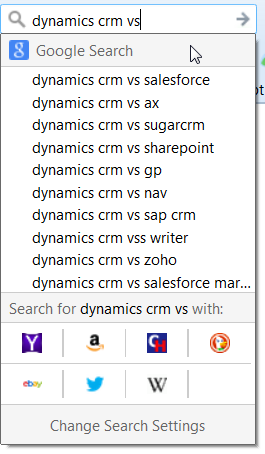
Just search for ‘<your software> vs’ in google, and behold: a list of alternatives!

dynamics-vs

Of course, you could also search for ‘<your software> alternatives’, or ‘<your software> alternatives free trial’.

But I don’t want the data to leave the company!

Okay, there might be a bit of a stigma here because your data is stored in an external environment. How valid that is… that’s for you to decide. Just remember that lots of ‘Enterprise Software’ already has SAAS and thus the data isn’t stored on your own servers.

And in case this wasn’t clear: that’s usually an advantage. No servers to buy, maintain, backup and upgrade.

Also remember that all email interaction with your customers passes through the big bad outside world.

And your own servers might not even be installed in your own data center, or you might be planning on migrating them ‘to the cloud’ in the future. And then what’s the point of being paranoid about an SAAS storing your data?

Reconsider having it custom developed

…depending on the situation of course. Usually easier said than done. Sometimes not.

If I hear about the total cost of some software, and then see what a jungle it is to navigate, and how few features are actually used, I often think it would cost a fraction to get it custom developed — usually not the whole offering, but just the features that are actually used.

There are exceptions, and there’s rarely a gray zone. Considering my background in software development, I might be biased.

Don’t blindly believe references

“XXX and YYY are using it too”
“If it’s good enough for ZZZ, surely it’s good enough for us”

You wouldn’t believe how often I’ve heard these as the decisive factor, when they’re far less relevant than the need for a user-friendly interface.

I think references are often used as shortcuts for proper due diligence.

References are a basic sales technique. References of well-known organizations are priceless. Keep in mind that these might have had a far better proposition than you, just to get them on board. I’ve done this myself. A product/service without references is so much harder to sell.

You can ask for an actual person to contact at these companies (not sure if this is common practice, but does that matter?). It’s usually the decision-maker though, or at least someone who will only say positive things. Someone who won’t tell you they made a bad decision, or just doesn’t know because they don’t use the software and no one dares to tell them it sucks.

Unless they’re really, really dissatisfied. I had this happen recently. My conclusion was that the vendor didn’t have any happy customers at that time and thus hoped that dropping the reference’s well-known name would suffice… that I wouldn’t actually contact them.

To get a more objective view: try to find someone unconnected at that company (check LinkedIn) and ask for their inside scoop. I have done this on occasion, and gotten valuable info (assuming my source was trustworthy).

Remember: Always take references with a grain of salt!

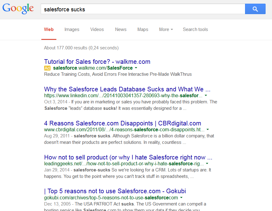
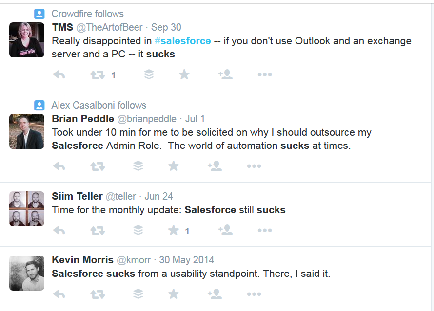
Look online for actual user’s reactions

salesforce sucks - Google Search


salesforce sucks - Twitter Search

But remember that very popular software will always have people who don’t like it, and also competitors spreading FUD.


Had a good read? Sign up here to get notified of future enjoyable, insightful and (dis)informative posts!

Comments? More tips? Frustrations? Dirty jokes? Leave them below!