
This article trended on Y Combinator’s Hacker News where it generated an elaborate discussion.
It was also voted the Best “Everything Else” Article of July 2015 on CodeProject.
And translated to Japanese (with my approval).
When I wrote my previous blog post, it dawned on me that a trained eye can often spot unfriendly software a mile away.
It’s just like forming and making a first impression when you meet someone new. Apparently, this takes about one-tenth of a second.
Unlike judging a person though, judging a user interface isn’t part of our instinct… yet. But within just a couple of minutes, and often much faster, it’s possible to get a pretty good impression of whether the user interface was thought about or rather just an afterthought.
As I wasn’t sure of how this happened, or which warning signs were actually firing, I started to pay attention and take notes.
Here are my findings…
Too generic or inconsistent use of terms/labels
These aren’t the user’s words, but rather ones the programmer comes up with.
I trialled event organizing software the other day. The visitor/attendee was sometimes called ‘user’, which confused the hell out of me (you could also add additional users/logins that weren’t visitors).
At the company I work for, we once prototyped a new wizard-like process. It consisted of several screens that used 3 different words to depict the same person: the trucker, the cardholder, and the starter (needless to say this was corrected before going into production… and why does this reminds me of The good, the Bad and the Ugly?).
When you know how the process works, you won’t really notice this. But when you’re confronted with this software for the first time, you might wonder whether they’re talking about the same person, or different persons in separate roles, or… who knows?
You don’t want to confuse your users. Hallway testing helps here.
An Excel/development IDE – like user interface
If you ask an inexperienced non-tech person to design a user interface, it often looks like it was designed in Excel. Excel is the most unconstrained application most people know, and a lot of software starts out as an Excel sheet before growing up into ‘real’ software.
On the other hand, developers have a knack of seeing everything as the user interface they’re most familiar with: their development IDE.
Use of image-only icons/buttons that have no distinctive meaning
Stock icon images seem suited when you already know what they represent, but when you see them for the first time you often don’t have a clue.
Unless it’s absolutely necessary, use words instead of icons… even though icons look better.
Unclear/confusing error messages
(written by the programmer).
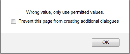
Test this by entering an incorrect value in a field or leaving a required field empty.
Do you immediately know where the error is (even without having read the error text), or do you get a generic ‘fill in all required fields’ or ‘this is not a correct value’ error?
Even worse is some database error text. Or no error at all, resulting in a record that wasn’t saved without you knowing it.
Too much text/instructions
‘If you are an X, then you have to fill in Y and Z. If you are not an X, please only fill in Z, unless Z=1, then you should fill Y too.’
I don’t know how this is in other countries, but in Belgium it feels like you’re filing your income tax.
This is typical of programmers being ‘smart’ by avoiding some extra steps/code… and shouldn’t get past QA. Things like this will not only cost you customers, but will also cause a lot of unnecessary service-desk requests.
A long time ago (the previous century actually) I developed EDI software, based on ‘Message Implementation Guides’ (MIG) that contained constructions like these. And instead of thinking about making this more transparent, we just gave the user a number of fields and the MIG’s instructions on which fields should be filled in which case. That was the way it was done, and we didn’t give it a second thought at that time. Thank god for the ability to learn from mistakes.

Excerpt from an EDI Message Implementation Guide
I’ve even seen this taken one step further into absurdistan when someone thought it was clever to ‘implement’ 2 different messages (data structures) that had some similarities in 1 set of forms.
The time this saves the developer never weighs up to the users getting confused and calling support.
Weird, irrelevant and complex date/time formatting
For example: ‘2015-06-29 15:44:21 EST’, which is probably the default, unformatted output of whatever language/framework the software was programmed in.
15:44 might suffice, or Jun-29 15:44 (which makes sense to European AND US users).
In some cases it can be better to have a more human, relative notation, e.g. ‘within the last hour’, ‘yesterday’, ‘next week’…
Being too Mouse-dependent
No logical tab ordering, no keyboard shortcuts: the need to do everything with the mouse.
This has been annoying users since the invention of the mouse.
Too many pointless message boxes
‘Are you sure you want to print the document?’
Then showing the print dialog where you can still cancel the printing process.
And just how bad is it to print something by accident that it needs your permission in the first place?
Inconsistent warning dialogs
A while ago I saw a CRM-ish application.
When exiting an unsaved contact’s form, it said
‘Are you sure you wish to exit without saving?’
When exiting an unsaved company’s form, it said
‘Save changes before exiting?’
Clicking ‘yes’ obviously gives two different results here.
The user interface is totally empty when starting out
When seeing a ‘clean’ installation or account, there are no instructions to get you started.
You should guide your users towards taking their first steps here.
“You don’t have any contacts yet. Click ‘add contact’ to add your first contact.”
“We see that you’re new. If you want a short tutorial click here.”
You get the picture.
Visual clutter
Unneeded use of separating lines, grouping boxes,.. less of these = easier on the eye. It’s much better to group things together by position than by placing them in the same box.
Do you know more immediate clues that you’re dealing with a lousy user interface?
Tell us in the comments!
Being User Friendly Beyond the Software
A company I once worked with had such long emails that users used to phone to ask, “You just sent me an email… could you please explain what’s in it?”
It was also common that when someone called with a question that wasn’t in the email, the email template was changed to include the answer. That seems the right, logical thing to do, no?
Unless the emails become so long that no one bothers reading them anymore.
Also, when customers called, the support team explained things with the terms they were seeing from the internal software – “I’m sorry sir, your validation is still ‘unverified’.” Unfortunately, in most cases, it meant absolutely nothing to the customer, they didn’t know what their ‘validation’ was and why it was ‘unverified’. And you could see the support people get annoyed because they had to explain this same thing over and over to the ‘stupid users’.
Making your user interface more friendly is an iterative process. The support requests should be regularly checked for recurrent issues so they can be fixed/clarified.
Agree or not? Do you know more immediate signs of a bad user interface?
Tell us in the comments!
Sign up here for more enjoyable, insightful and (dis)informative posts!
July 3, 2015 at 2:05 am
“15:44 might suffice”
Oh, no! This drives me crazy. I saw a blog post the other day which said it was published “3:45 Tuesday”, and the tooltip on this text said exactly the same thing.
In a paper log book where every entry on the page is for Tuesday June 29th, it’s fine to just say “15:44”. Unless there’s plenty of context, though, “15:44” is completely inadequate. It’s taunting me. It’s telling me the computer recorded exactly when it happened, but it won’t tell me.
“or Jun-29 15:44 (which makes sense to European AND US users).”
Sure, at the mere cost of being extra confusing to Asian users. Ignoring Asia is the new ignoring Europe.
This isn’t a hard problem to solve. Everybody who ever took a science class in high school learned some variant of ISO-8601 (even if they didn’t learn it by that name). “2015-6-29 15:44” might not be the prettiest date format (I wouldn’t use it on my wedding invitations) but it’s clear and unambiguous and universal.
July 3, 2015 at 3:02 am
that, that 10000 times
UX designers aren’t always fault free it turns out. please use full date with the YEAR. Like your blog does, heh.
July 3, 2015 at 8:07 am
I think it totally depends on the situation and the number of items grouped under the date/timespan.
For a blog post, it certainly makes sense to use the full date. For your list of emails for example, it doesn’t. Unless you only get a few emails per year.
July 3, 2015 at 5:48 pm
The problem with 2015-6-29 15:44 is that some countries (U.S) use year-day-month, while others (Canada) use year-month-day. In the case of 2015-06-02, it’s unclear whether that is June 2 or February 6.
July 4, 2015 at 10:38 pm
Not true. Only 02-06-2015 and 06-02-2015 are confusing to Canadians. When the year is first, as per ISO, the middle digits are always months. I am Canadian.
July 6, 2015 at 7:46 pm
I’m Canadian too. The US date standard is month-day-year. In Canada day-month-year is acceptable but the ISO year-month-day is preferred.
July 7, 2015 at 10:36 am
I’m British and 2015-06-02 would be confusing to me, is it June 6th or Feb 2nd??
July 3, 2015 at 5:52 pm
That date format is not universal and it has a great ambiguity.
Here in Brazil, for example, we use Day-month-year OR year-month-day.
Greatest unit to smallest, or smallest to greatest.
2015-6-7 is it 6 July or 7 June?
July 4, 2015 at 5:45 pm
Relevant XKCD: https://xkcd.com/1179/
I never understood the logic behind writing a date without sorting units greatest -> smallest or smallest -> greatest.
Why? Does not make sense to me.
July 3, 2015 at 2:28 am
I forget which application it was but there was dialog that often came up like:
“Are you sure you want to cancel?”
and, of course the two available buttons were:
“Yes” and “Cancel”
July 3, 2015 at 7:37 pm
That’s precisely one of the things I reported to Soundcloud.
July 3, 2015 at 3:42 am
Another one I’ve found quite consistently, as you show in the header picture, is telling users what to do.
If you have to explicitly tell users what/how to do some basic action it means that you interface is not clear enough.
April 19, 2017 at 4:37 pm
THANK MOTHER OF ALL THE GODS YES TO ALL OF THIS ^
July 3, 2015 at 3:42 am
As a grey beard IT guy, there used to be a time when we mocked early Macs for error dialogs like “Error saving document. Reboot.” with only the single OK button on the dialog. A friend turned to me and said, but I’m not ok with that!
We used to posit the existence of a dialog that said “Disk error. Reformatting…” with just an OK button. It’s more user-friendly that way after all.
(Of course today I use OSX routinely in preference to that stuff from Redmond. 🙂
July 3, 2015 at 4:33 am
I agree with most of your points, great article – all my mistakes I keep making flashed in front of my eyes.
But I just clicked on the “cover photo” of this article expecting it to enlarge (it was clickable with a pointer icon), and lo, it refreshed the page!
We all know and can point out mistakes when we see others’ work, but being able to find and fix mistakes in our own work – it’s an art, and takes immense effort
July 3, 2015 at 8:11 am
That’s a good point.
Apparently (and also that was pointed out by someone else) the theme I used also can’t be zoomed. I wonder why.
Will have to look into it one of these days.
July 3, 2015 at 9:29 pm
In most cases the main succes scenario is the only priority. Exceptions come second. The manager sees the developer rather implement more main succes scenario’s of other usecases then spending time on things that do not always happen or can be overcome by training the users. When the main succes scenario works, usability becomes second priority.
July 31, 2015 at 9:57 pm
Aravind,
Don’t waste your precious time trying to find all the mistakes in your own work. That’s what user-testing is for.
This also addresses the challenge that, in most cases, we are not the target users for the stuff we design. So we might think that a design is great and nearly flawless, because it works for us, and we’ve checked as many design heuristics as possible.
Then you put it in front of actual users, and they are completely stumped by the UI.
So let these users validate the UI from the get-go.
July 3, 2015 at 10:30 am
“Clicking ‘yes’ obviously gives two different results here.”
The main problem here is buttons saying just ‘yes’ or ‘no’. A good button should say what it is going to do, like ‘save first’ or ‘just quit’.
July 3, 2015 at 9:19 pm
As to dates, since my Dad was an Army surgeon, he always wrote dates as dd-Mmm-yyyy; 03-Jul-2015 or 3-Jul-2015. That pretty much reduces the ambiguity of the date. As for time, most folks I know don’t understand a military 24 hour clock so I always use HH;MM ?M but you must remember to add the AM or PM to remove ambiguity, again. Luckily the HH:MM is universal, at least to my knowledge.
There are many things you touched on in this article that rang true to my own beliefs and recommendations. Only toolbar buttons should be flat and use icons. if possible they should also provide an option for text but at the very least they should have a tooltip to define their action in addition to a well contrived icon. All other buttons should be text only since in these cases adding an icon tends to clutter the UI.
Consistency in alignment between prompts and controls and, NEVER using right justified prompts… EVER! Consider this, when you scan a list for something is it easier to scan when they all begin in the same column? Yeah, they do!
Consistency in verbiage is another, as touched on here.
Dialogs should be easy on the eyes no matter what they are used for.
And THANK YOU VERY MUCH for including the lack of use a pointing device. An end user, the persons you wrote this for, should rarely, if ever, need to move their hands from the keyboard. The keyboard is where data entry resides unless you’re dragging and dropping something.
Ok, ‘nuf said… EXCELLENT ARTICLE, THANK YOU!
July 5, 2015 at 9:29 pm
Here’s my take on the same problem:
https://www.linkedin.com/pulse/how-detect-bad-web-design-alexander-mikhailian
July 13, 2015 at 10:03 pm
Sounds exactly like Salesforce.
July 31, 2015 at 10:09 pm
A characteristic that works surprisingly well as an indicator of a bad UI is symmetry.
That’s because achieving a symmetrical arrangement of controls often requires violating established design principles, like the Gestalt Laws of Proximity and of Similarity.
In these UIs, completely unrelated controls are often grouped closely together, and sometimes controls with similar appearances operate in very different ways.
One of the worst examples I’ve seen uses two controls that look like rotary dials. Only one of them actually rotates, however, whereas the other only operates as a push button. But, hey, let’s make them look exactly the same, if it makes this thing look symmetrical, right?
To see what I mean, simply look at just about any car’s center console: If it’s symmetrical, look a little closer, ’cause chances are that the designer had to make some really bad design decisions to achieve that pleasing-to-eye(?) arrangement.
February 12, 2016 at 1:09 pm
I’m in Australia. We get input from the UK, Canada, USA, etc. so we have to try and work out what the hell you meant some of the time. In a database or Spreadsheet opt’s ok. We can look at the raw data (5 digit number for the date). In a document it;s a little more tricky when you get 02-01-2016. Seeing where the document came from gives a clue.
I always use the format 01-Jan-16 01:30 PM. ANyone can understand that.
I would imagine that the more important issue is not the output but the input.
If someone in the U.S. enters a date in an Australian or Canadian website for example.
btw When are they going to start driving in the right side of the road (i.e. the left).
August 21, 2016 at 7:28 pm
I can’t stand meaningless error dialogs. Things like “Gerbil mismatch error: code 568992”. What that means is anyone’s guess, let alone how to fix it, and Googling the error only sometimes helps.
Antivirus/antimalware apps, aside from most of them being useless at preventing zero day attacks and often producing false positives, are always presenting users with incomprehensible messages about suspected malware. How the hell am I meant to know what the obscurely named file is and does? Surely it’s their job to explain that to the user? Not to expect the user to spend minutes researching the file and still not be sure at the end whether the file is safe or not. Most antimalware software in its present form is unfit for purpose. What the solution is I don’t know. White listing? Sandboxing? Hardware and software built from the ground up with security in mind? Something else?
Opera Mini for Android gives you layout options. One with forward and back buttons, another with tabs, but no option with both. But I want both and am not given the option. Why not? Also as far as I can tell, the only way to access the Bookmarks is via the Home screen as there’s no Bookmarks item in the menu accessed by pressing the large red O icon. That makes no sense to me whatsoever.
Another bugbear is call centre staff who can’t answer your query or give you incorrect, misleading or inadequate information.
I also can’t stand it when the call centre is based in India or somewhere in that part of the world because it’s a lottery as to whether the person you speak to speaks decent English and/or has a thick accent. I’m often having to say “Say again” or “Sorry?” or “Can you repeat that?” and it drives me nuts. Also, I use a shortened version of my name (it’s not Peter) and I’m always being asked to “confirm” my name by giving its full form, which never happens when speaking to someone in a UK-based call centre. Things like this provide a horrible UX and make the firms in question look unprofessional.
Next there is so much unintuitive software out there it boggles my mind. I often wish a feature provided worked differently but there’s no option to change its behaviour. Or I wish that a feature existed that hasn’t been provided. Or that I could remove features I don’t need or want (with the option to put them back if needed). Then there’s confusing icons whose image bears no relation to what it does. Misleadingly/confusingly named menu items. Hard to find apps/features. Tooltip pop-ups that provide inadequate information as to a button’s function. Help files that don’t explain anything, or at least not in a way that makes sense to anyone who doesn’t have a doctorate in computer science. Diagnostic walkthroughs that fix nothing (or more often than not don’t even list the problem you’re experiencing). Apps that require too many steps to carry out the task you want to do. Apps that don’t get fixed even when you email the company and tell them about the problem.
I could go on…
A good UI to me means that I can use an app without having to read a manual. Things should be intuitive and the more complex functions within the app should be explained to me as I go along. Like the old Windows paperclip (“I see you’re trying to hack into GCHQ. Can I help?”) but implemented in a much better way: detailed, relevant, clear, and actually enabling me to achieve the task at hand.